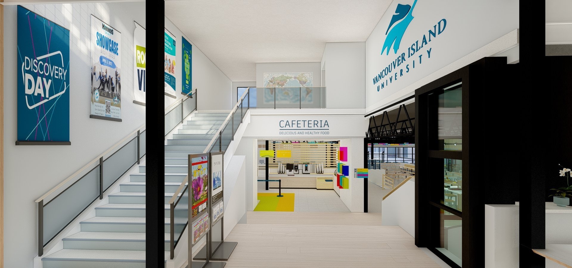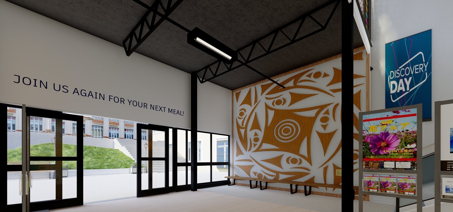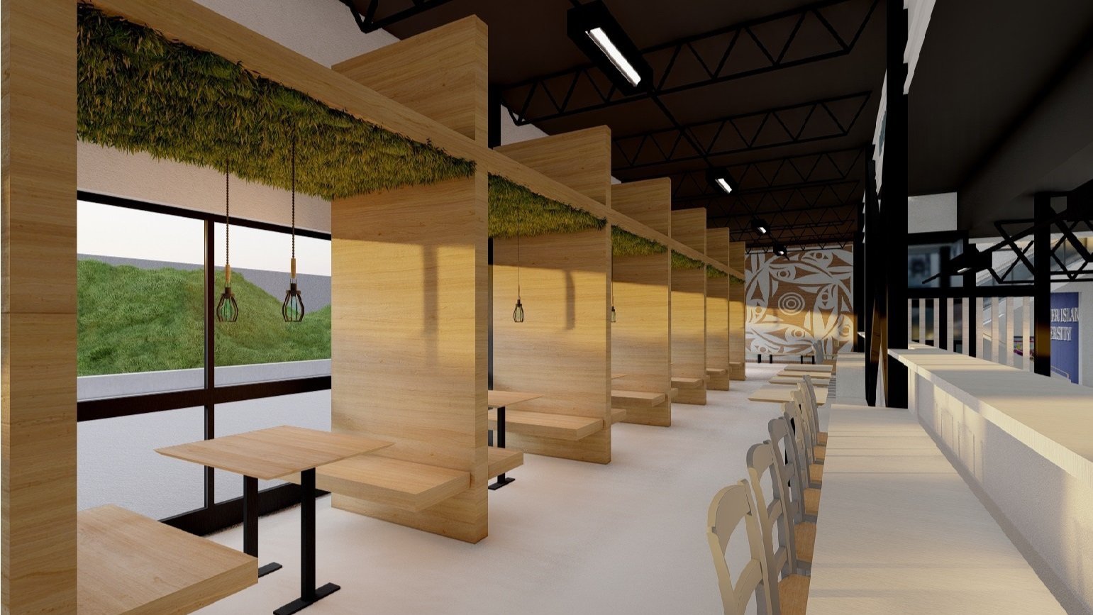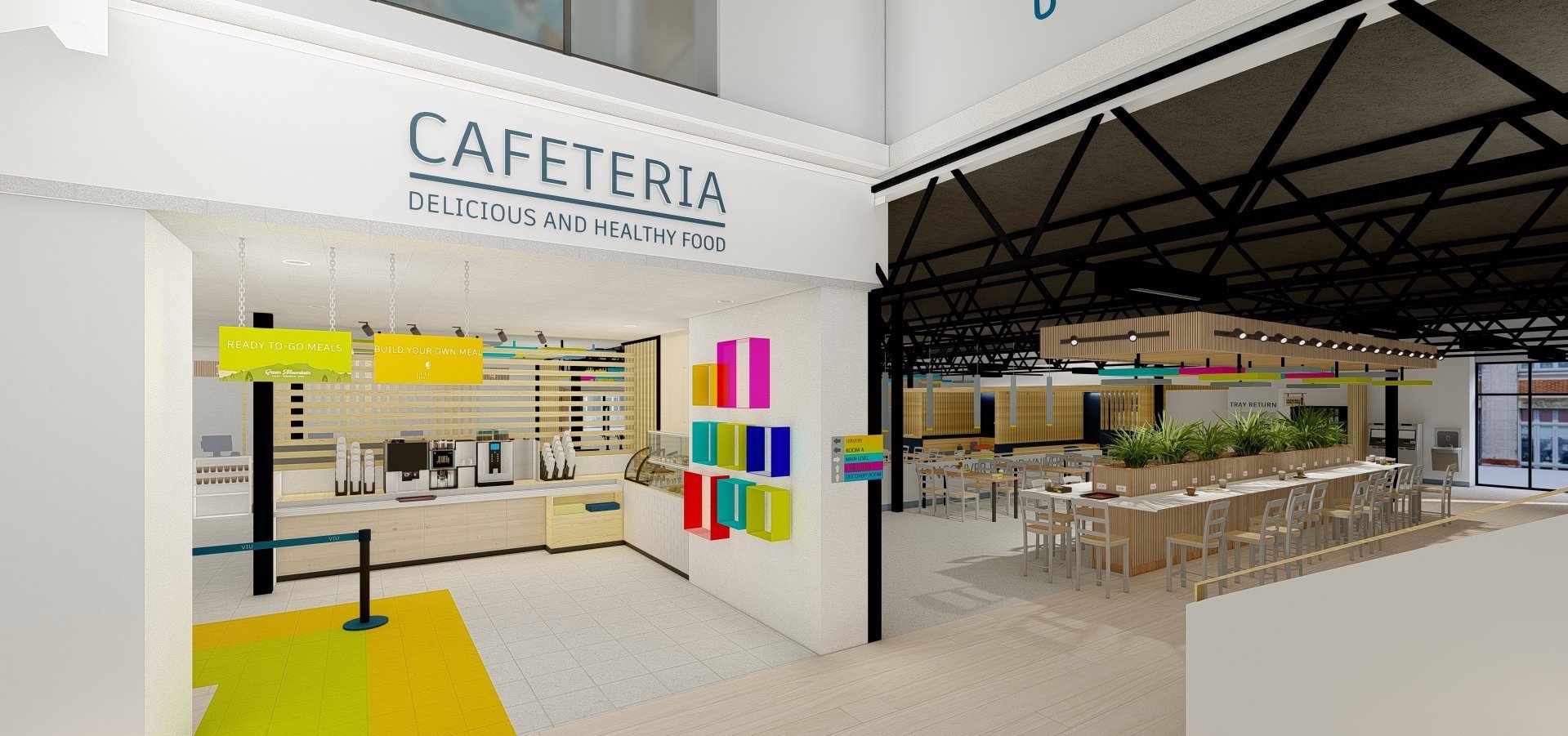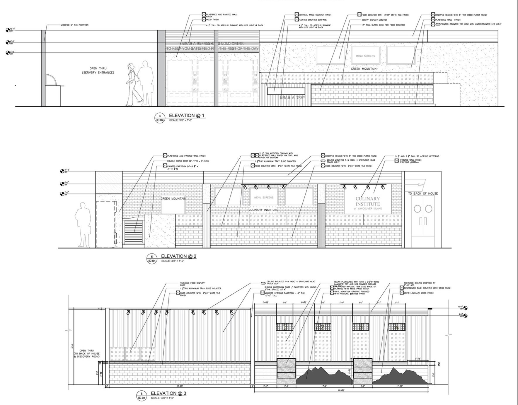
During my time at Vancouver Island University, a unique opportunity presented itself when the administration decided to redesign the campus cafeteria.
Rather than outsourcing the project to a professional design firm, the university saw an educational opportunity: why not leverage the creativity and skills of their own interior design students?

A Real-World Design Challange
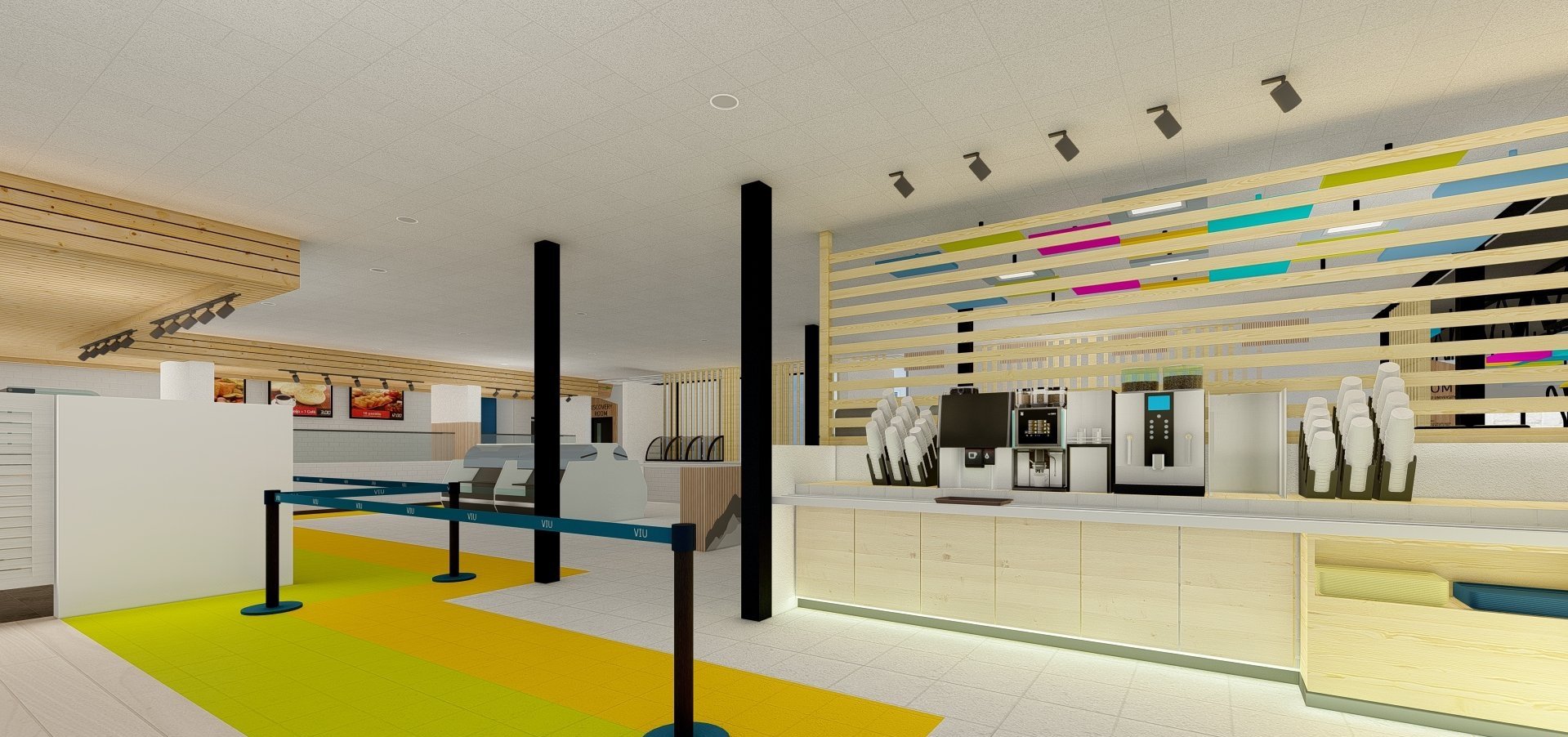
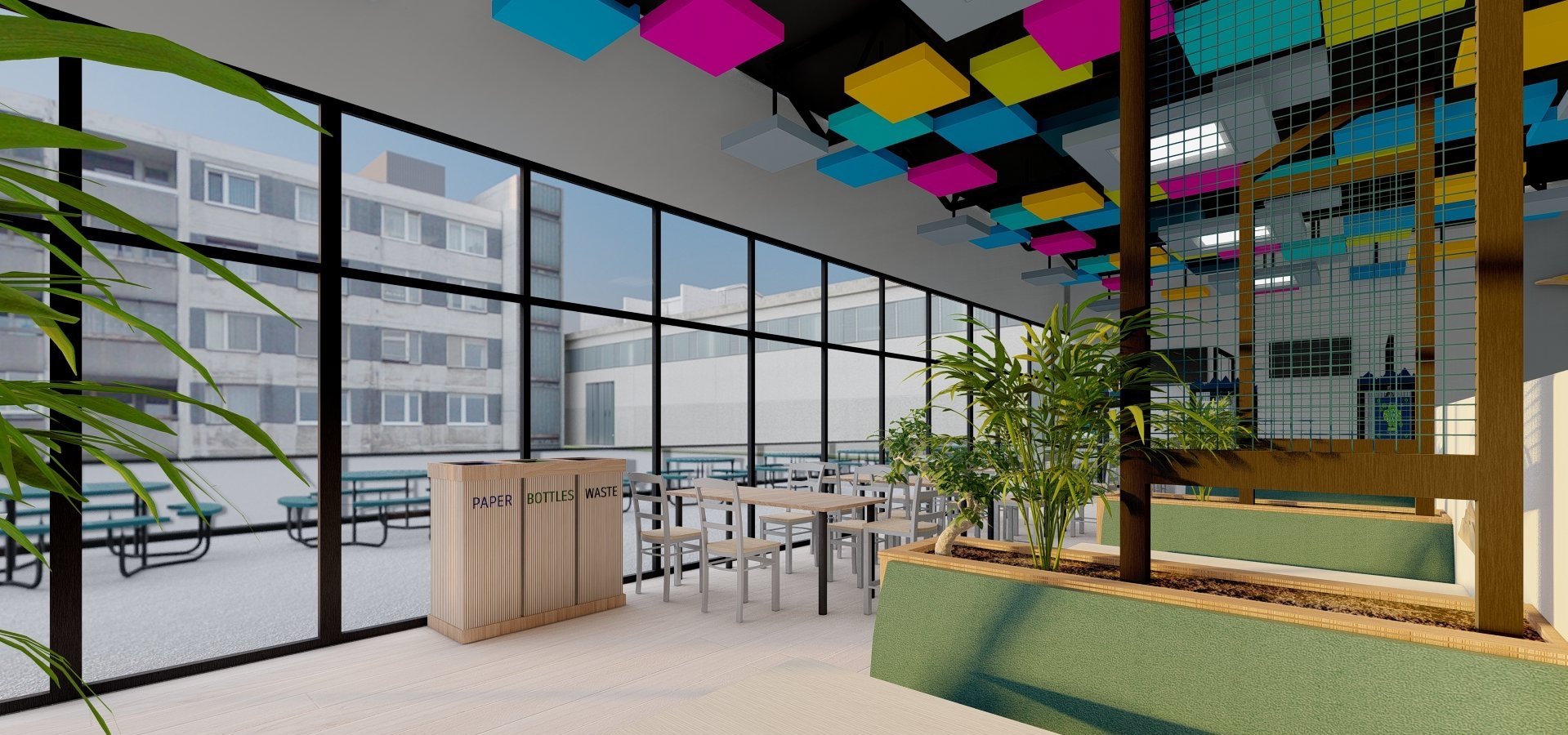
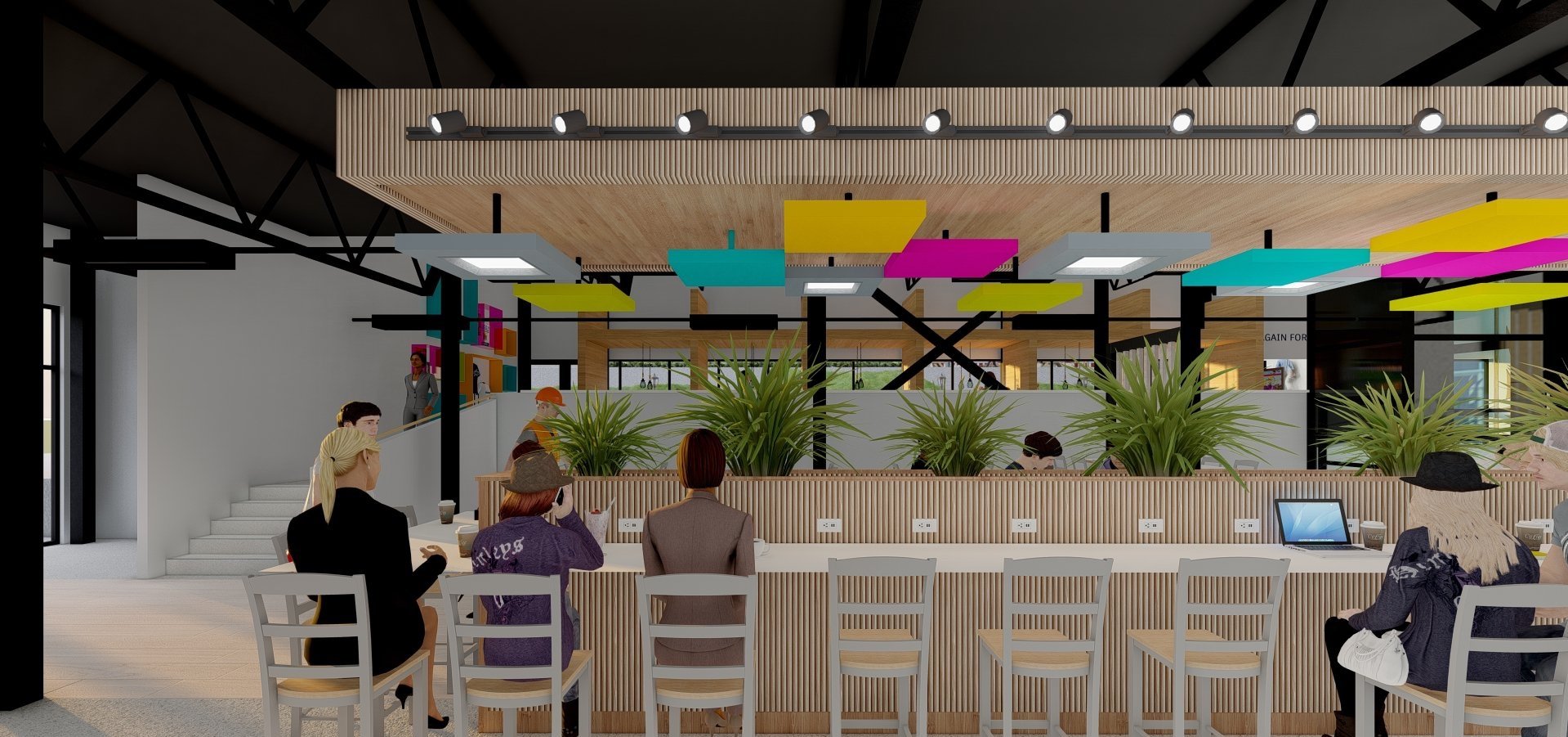
This challenge was both exciting and daunting. I was given just three weeks to completely reimagine the cafeteria, focusing on both the seating area and the serving area for the culinary students. This project was a real-world test of my ability to apply what I had learned in my courses to a practical scenario with real stakes and a tight deadline.
Collaborating closely with culinary students and faculty, I began by understanding the needs and desires of the cafeteria's users. I conducted surveys and interviews to gather insights on how the space could better serve its purpose, improve flow, and enhance the overall dining experience.
“The cafeteria feels a bit dull, like it’s just about getting people fed and out the door. It would be amazing if the space could be more vibrant and really reflect the spirit of the school—it’d make working here feel a lot more engaging, too.”
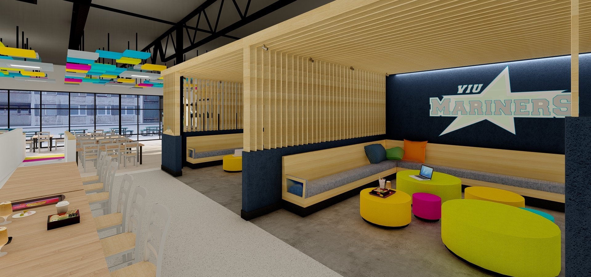
“Nobody goes to the cafeteria to hang out. You’re in and out of there as fast as possible. The only time I see people in there is when they are using it for shelter from the rain, and even then, they choose to stand outside under the covered area.”
“Getting through the serving area is always a struggle. Half the time, you don’t even know if you’re in the right line, which makes it crowded.”
Vibrant Inspiration
In conceptualizing the redesign of the campus cafeteria at Vancouver Island University, I drew significant inspiration from the university’s official bright green, orange, pink, and blue colours. These vibrant hues symbolize energy, creativity, and a modern outlook, perfectly reflecting the dynamic spirit of the university community. Incorporating these colours into the design brought a sense of vibrancy and identity to the space, creating a visually engaging environment that resonated with students and faculty alike
